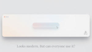
I remember opening a new client’s homepage and thinking, “This looks gorgeous.” Subtle shadows. Muted colors. That high-end minimalist feel that everyone seems to want these days. But there was a problem — I couldn’t tell which buttons were clickable. And I knew a screen reader wouldn’t have a clue either.
That’s the issue with Soft UI. It may be trending, but it comes with real risks if you’re not careful — risks that can turn into ADA complaints.
What Is Soft UI — and Why Is It a Problem?
Soft UI is a design style that uses light colors, blurred shadows, and low contrast to make everything look smooth and subtle. It’s sometimes called “neumorphism.” Think buttons that barely pop out from the background or icons that fade into a sea of white.
The problem? People with visual impairments — including low vision, color blindness, or sensitivity to glare — may not see what you want them to see. When your site relies on shadows or near-white text to guide interaction, those cues vanish for some users.
Under the ADA, that’s a barrier. And barriers are what trigger legal exposure.
As an ADA defense lawyer, I’ve seen businesses overlook this simply because their site looks clean. Clean doesn’t mean compliant.
Where Soft UI Breaks Accessibility Rules
Here’s what I flag when Soft UI shows up in a website audit:
- Low color contrast between text and background
- Buttons that aren’t clearly visible
- No visual indication of focus for keyboard users
- Icons without text labels
- Overuse of light-on-light color schemes
The WCAG requires a minimum contrast ratio of 4.5:1 for normal text — and 3:1 for large text. Most Soft UI designs fail that test out of the gate. Add poor keyboard navigation or missing ARIA labels, and you’re stacking violations.
What the ADA Expects — and What You Should Do
The ADA doesn’t say you can’t use Soft UI. It says your site must be usable by people with disabilities. That means:
- Clear visual contrast
- Text labels for icons and buttons
- Obvious focus states for users tabbing through the site
- Logical HTML structure that works with assistive tech
If your design blurs these lines — literally or figuratively — you’re inviting compliance issues.
A Simple Fix That Makes a Big Difference
If you’re set on a Soft UI aesthetic, there’s a compromise. Offer users an alternate design mode with higher contrast and clearer navigation. Or test your current layout using accessibility tools to see how it performs. You might be surprised at what disappears when you switch to grayscale or increase zoom.
I’ve helped clients make small adjustments that preserve the look they want while eliminating legal risk. Most of the time, it’s a matter of adding definition — a darker border here, a bold label there — nothing that ruins the design, but enough to make it usable.
Don’t Let Style Open the Door to a Lawsuit
Design trends come and go, but lawsuits stick. ADA compliance isn’t about being perfect — it’s about being accessible. And Soft UI, left unchecked, can quietly put your business at risk.
If you’re unsure whether your site crosses the line between subtle and inaccessible, we can review it. Our ADA defense law firm works with business owners to spot compliance gaps before they become legal claims.
Want to talk through your site? Reach out here. Let’s keep your design sleek — and safe.


